Hello Microsoft Support Team,
I recently received the latest Windows 11 update. At first, I tried to fix the new layout in the Settings under "Personalization" -> "Start", but for some reason, the customization options there have been completely stripped down and neutered. Since there is no way to change this back or turn it off in the settings, I decided to fully embrace your new UX/UI direction.
Having a search bar on the taskbar and then IMMEDIATELY another search bar right above it in the Start Menu is an absolute masterclass in design. It assumes the user might forget why they clicked the first one, which is very thoughtful! It’s so convenient while your cursor is moving from the first bar to the second one.
However, I feel like you guys stopped halfway. Two search bars are good, but they don't fully unlock the potential of my monitor.
I have designed a concept (please see the attached image 222.png) that improves your vision. I added:
Search bars instead of pinned apps.
Search bars instead of the "All apps" list.
Vertical search bars on the sides (very useful if you tilt your head).
Four Search buttons on the taskbar.
Please forward this directly to the Windows 11 Design and Engineering team. I haven't patented this layout yet, so you can take it for free. Let's make Windows look like a real smartphone!
Best regards,
A very satisfied Windows 11 user.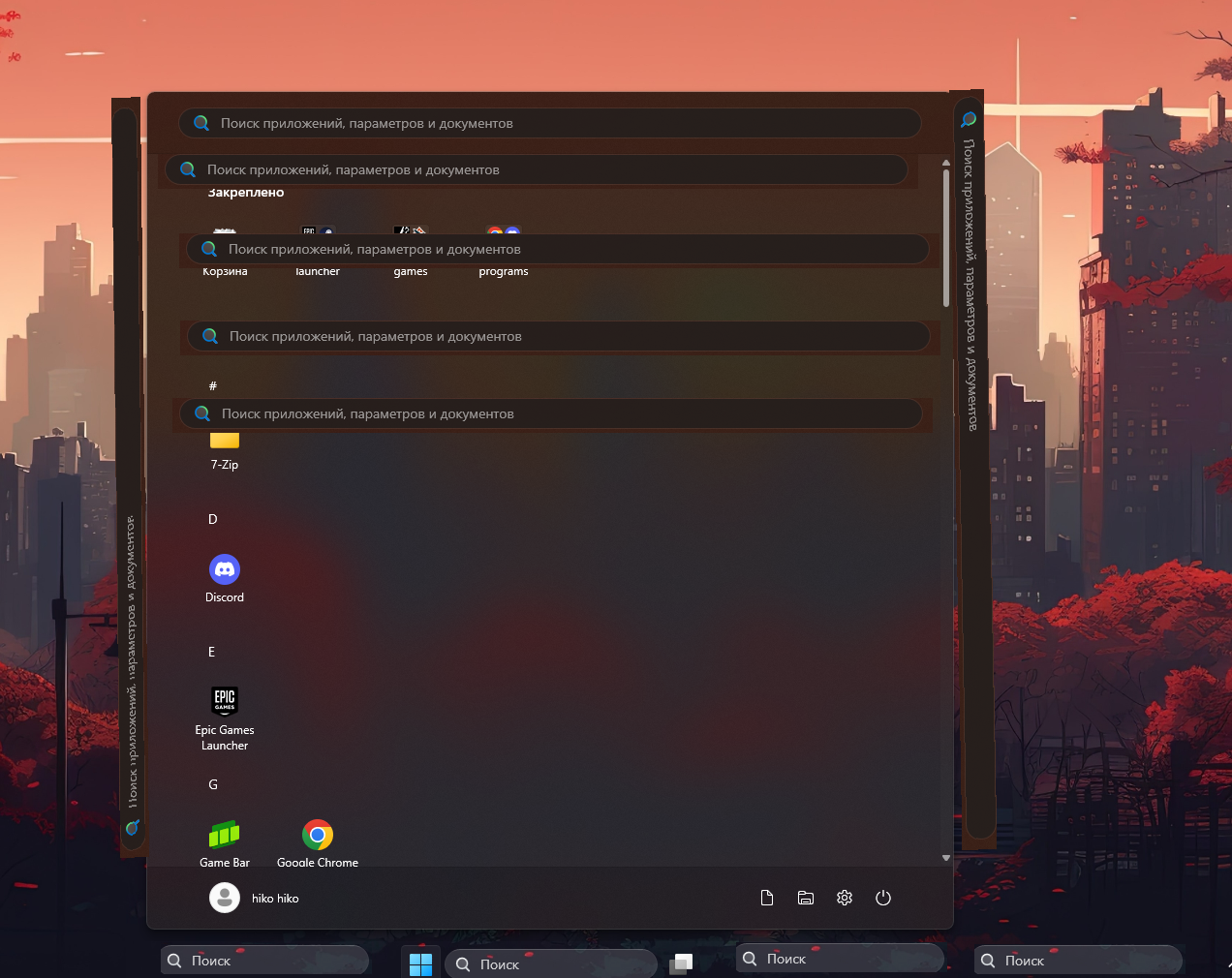
' cx='32' cy='32' r='32' /%3E%3Ctext x='50%25' y='55%25' dominant-baseline='middle' text-anchor='middle' fill='%23FFF' %3EHH%3C/text%3E%3C/svg%3E)

' cx='32' cy='32' r='32' /%3E%3Ctext x='50%25' y='55%25' dominant-baseline='middle' text-anchor='middle' fill='%23FFF' %3EI%3C/text%3E%3C/svg%3E)